Big "Buts"!

I’m talking about big “buts” in decorating today…three of the biggest hesitations I see when I’m advising clients. And I’m going to help you overcome them.

“BUT” NUMBER ONE: “I HAVE ENOUGH LIGHTING”:

Many clients already have recessed lights, or are going through a renovation and decide they want them installed. I always recommend they still add other sources of lighting. A basic tenet of interior design is that lighting should be layered to serve different purposes: Ambient (general lighting), task (for specific jobs or situations), and accent (to highlight features of the room, like great architecture or artwork). Overhead lighting is not enough. It casts shadows on the face (yuck). Adding a dimmer helps, but recessed lights create no ambiance, warmth or drama.

You need to add floor lamps, table lamps, chandeliers, sconces, picture lights, LED strips in cabinetry…. not all of these at once, but certainly a couple of them.

Not the enemy, I promise.

“BUT” NUMBER TWO: “I WON’T PAY FOR CUSTOM MADE”:

I completely understand, and not everything needs to be custom made. I gladly mix retail and custom items. However, I strongly recommend investing in at least a few specially made items, especially window treatments and pillows. Cheaply made or poorly scaled drapery kills the room. Poly-filled throw pillows are fine for basements, mud rooms, etc. But for your living room, please be more selective. The biggest bang for your buck might end up being a set of pillows in an eye-catching designer fabric.

Moreover, custom made furniture is a dream. Exactly the dimensions you want, the materials you want, and no one else has the same piece. Yes, it is usually more expensive, but a good quality custom sofa, ottoman, dining table or console will make you happy for years. I’ve designed furniture to meet my clients’ very specific needs for storage. It is a lot of fun, actually.

 “BUT” NUMBER THREE: “I CAN’T, I HAVE KIDS”:

Most of my clients have young children. After we have considered important safety concerns, the next hurdle is worrying about little dirty hands and feet on the furniture, rugs, and walls. We select upholstery fabrics and rugs that are spot cleanable, and wall coverings or finishes that are wipeable. Nothing is bulletproof, but wow, these are amazing materials.

However, sometimes you just love something and it is not available in a stain-resistant material, or it might scratch, or show fingerprints. I do have some advice. First, try to be OK with that. Life is too short to stress over scratches and dings, and they can usually be repaired or refinished. “Too perfect” also looks like no one uses it, no one enjoys it, and it is just for show. Are you just putting on a show? Do not be overly concerned about imperfections. Rumor has it that the heiress Brooke Astor would take scissors to her new upholstery and lightly fray the arms and seat cushion edges, so the furniture would not look so brand new! Perfection is overrated.

Furthermore, kids can learn to be more careful. I love my kids and have avoided certain materials in order to keep them safe (and my sanity) over the years, but I do not think children should rule every aspect of the house. They will learn how to behave around nice things if you teach them. That doesn’t mean putting porcelain in the playroom, but it does mean that maybe you have a new rule about playing football around the nice new table lamps.

Feel better? Now put your feet up on your new custom cocktail ottoman, turn on a reading lamp, and relax.


Angled Ceiling Help!

Some (most?) houses have awkward architecture, whether from their initial design or as renovations were made over the years. One of the most frustrating features is the angled ceiling, particularly when it is not symmetrical. How do you treat it? Do you make it a feature or try to make it disappear?

Ninety-nine percent of the time, make angles blend in/disappear rather than highlight them. With the right circumstances (most likely, a child’s bedroom) I would explore making it a fun feature.

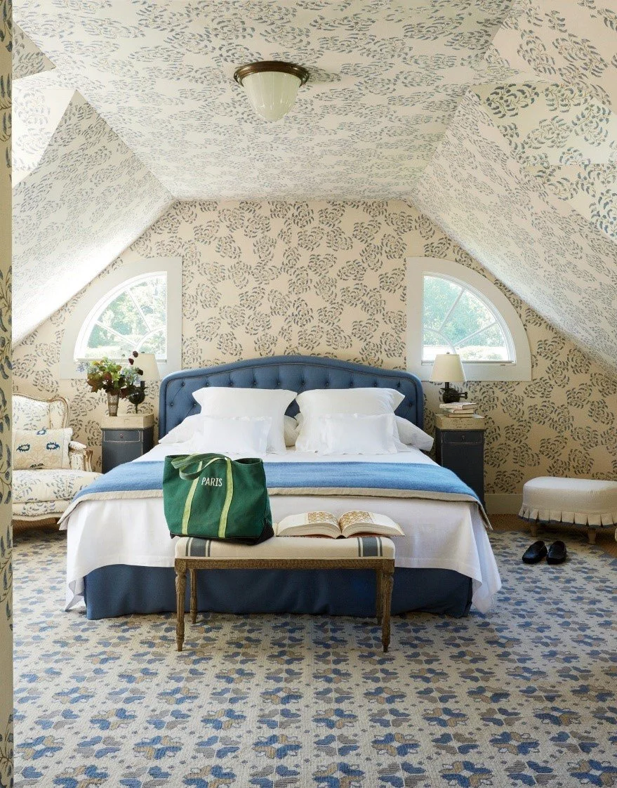
If you’re dealing with angled ceilings, it usually involves an attic, bedroom, laundry room, or basement. One solution is to COMMIT to a BIG, BEAUTIFUL SOLUTION! (Sorry to yell.) Fully wallpaper the space, covering the ceiling as well as walls. Own it! This works well if you have a lot of awkward angles and/or you want to create a very cozy cocoon sensibility. Bedrooms are a great place to do this.

Mark Sikes/Linda Holt Photography

I selected this image because the interior designer made a small, awkward space visually larger by fully covering the walls, ceiling, and windows in the same pattern. It’s a fabulous room. The only teeny little issue I might point out is that I would have aligned the pattern on the left window with the wallpaper pattern for a more seamless look, but this is the great Mark D. Sikes so I hesitate to criticize!

Featured in Vogue 2014

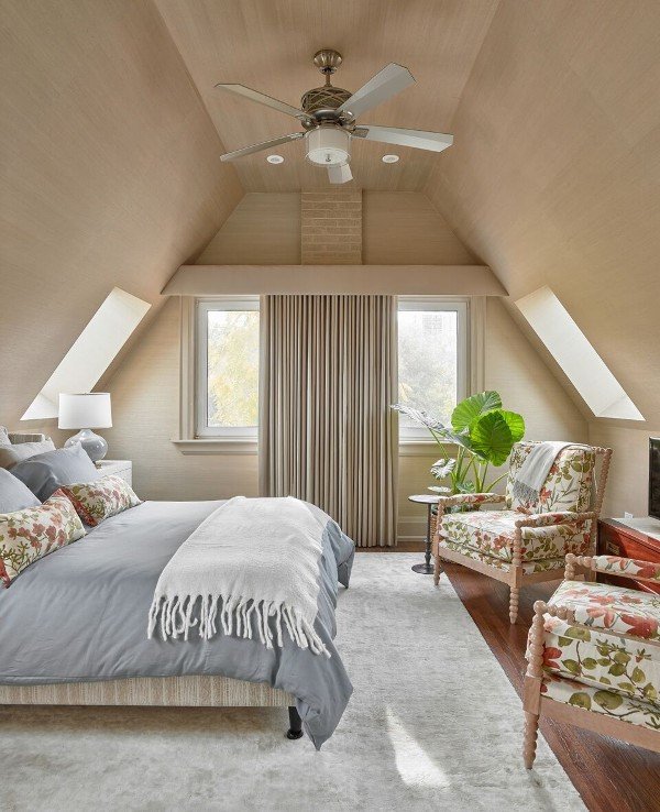
You can do this with grasscloth or another tonal, textured wallcovering if you aren’t a floral or gingham sort.

Black Sheep Interior Design

What if you love wallpaper but don’t want to cover the ceiling with it?

Another thought is to treat the slope as part of the wall rather than ceiling, and carry the wallpaper up to the flat horizontal plane of ceiling. That can be painted the field color of the wallpaper (in the case below, white) or even a color pulled from the wallpaper palette, depending on how much you want to emphasize the ceiling. If it’s a small room, I am inclined to select the field color from the wallpaper. But it is a very case-by-case basis.

Caitlin Wilson Design

You can also paint the walls and ceiling the same color. I’ve done this a million times to make a room look and feel larger, and blur the lines between angles and flat planes so it’s not so awkward.

Martha Stewart— don’t ask me why the pendant is hanging there, though. Watch your head!

 Now for some “DON’Ts”

At least paint the ceiling like the walls….

Extreme closeup of awkward angle painting—arghhhhh

What if the angle involves a shower? I have designed a few bathroom renovations where the ceilings were angled. Depending on the location and direction of the angle, you might take the tile all the way up in the shower.

I just did this one (excuse the amateur photo). We are still waiting for the shower enclosure.

Just need that door!

Amy Lind Interiors

There are lots of other little painting/wallpapering tricks up my sleeve. But if you want to hear more, and especially if you are in Westchester, NY or Fairfield County, CT, reach out!


Black is Hard to Get Right

Black is always in, but now it’s REALLY in. It’s everywhere—bathroom fittings, kitchen faucets, furniture, light fixtures, you name it.

I love black, but it’s a problem when people are too heavy-handed with it. I am currently designing a living room for a client who loves black, and we already have a fireplace and glossy black grand piano providing the major black elements. We want to keep the large, bright room light and airy, not especially cozy or too dramatic, so that means staying away from dark walls.

The key has been for me to repeat black throughout the room, but in a lighter way. For instance, none of the upholstery pieces are going to be black. The end tables will be marble topped with thin and open black metal bases, not solid black wood boxes. I am avoiding black drapery hardware and instead choosing lucite and brass.

Unfortunately, as with everything (I’m looking at you, grey), there’s a tendency to go overboard.

For example, a popular design blogger did this:

NONONONO

NONONONONONO

This is all too much together. I think the light fixture put it over the edge. It feels heavy and oppressive hanging over your head. This room is not timeless or welcoming.

I think if someone said they were designing their dining room with a set of painted black french doors, eight completely black wood chairs, a black sideboard, a large black vase on the table, five black woven light pendants above, and black detailed art (not to mention the view of the large black TV, black firebox and black fence outside) I would suggest eliminating or limiting a few things. Maybe upholster the dining chairs in a neutral fabric with a black chair frame, for instance.

Now sometimes, we go all in with black to create a mood. I have this book on my coffee table. Importantly, look how much white balances the black walls. Celerie Kemble always has quirky designs but she grounds them with classicism.

More black walls balanced by white:

Aerin Lauder’s home on Long Island

And a few examples of light rooms with touches of black:

Thomas Pheasant

Thomas Pheasant

Greg Natale

Fully recognizing that these rooms have amazing architecture to begin with, I would just point out the use of black was clearly considered and weighed to be used for the most impact.

If you love black but struggle to use it correctly, please feel free to reach out to me for assistance.

Think About Your Seat!

When shopping for a sofa, one of the decisions to keep in mind is how many seat cushions you prefer. It might not be something you pay attention to naturally, but it is an important consideration. I am going to go over the three basic types--bench seat, two-cushion, and three-cushion seats—and explain the differences. Note that these are general guidelines and often depend on the overall scale of the sofa. A more standard 85” wide sofa might have different considerations than a 100” wide sofa.

Bench Seat

Hickory Chair bench seat/tight back sofa

Sofas with bench seats are my personal favorite. I think they look very tidy and tailored, and they offer the benefit of being able to squeeze in an extra person without worrying about who gets “the crack.” The bench seat offers more space because it doesn’t visually demarcate seats. This is particularly true when it also has a “tight back” (no back cushions) as shown above.

However, especially if you are using a patterned upholstery fabric, you might end up with seams. Without going into terms like “railroaded” and “up the roll” fabric application here, I recommend you ask the upholsterer or sales person about whether seams will be present so you can make an informed decision. If even tiny seams along the width of the sofa will bother you, select a solid fabric without a definite direction and ask that it be “railroaded”. And sometimes the seams are present as a design feature, no matter what the fabric, so ask!

Another consideration is stains; obviously, there are only two sides and one cushion, so it’s a bit harder to hide an unremovable stain if it happens twice (once on each side). However, with performance fabrics and talented upholstery cleaning specialists, I am less bothered by this scenario occurring. I would rather use a high-quality performance fabric and even an upholstery-protecting spray service like Fiber Seal or Ultra-Guard.

No matter how many cushions on the sofa, I recommend that my client regularly flip them to ensure even wear over time. I flip and rotate my own cushions quarterly, with the change in season, as an easy way to remember.

Finally, if you like to nap on your sofa, a bench seat offers a more uniform platform than one with cracks.

Two-cushion

Two-cushion sofa from Mitchell Gold & Bob Williams

The image above has two seat cushions. Specifically, it is what we call a “two over two” sofa, or two back cushions with two seat cushions. If you think about where the sofa is going, and how many people you need to fit on it, that will help you decide if this is the right choice for your room. The two wide seat cushions are very roomy, and if you usually only need to seat two adults per sofa, it works out. When children are on a two-cushion sofa, they squeeze in three-to-a-sofa without minding the crack. The look is a bit more relaxed than a bench seat.

It is easier to clean the cushions on a multi-cushion sofa or, heaven forbid, flip a cushion with an unremovable stain. Again, though, performance fabrics and a good upholstery cleaner will save you. Please also rotate and flip your cushions regularly for best long-term wear.

If you are using a fabric with a pattern, please make sure the upholsterer is aware of correct pattern placement on each cushion.

Three-cushion

Three-cushion sofa from One Kings Lane

The statements above regarding two-cushion sofas apply for three-cushion sofas as well, with the additional note that (given an equal overall sofa width) a three-cushion sofa tends to look more formal than a two-cushion sofa. Each seat will be narrower. It is possible for three adults to have their own cushion. (Whether unrelated guests will want to sit that close to each other is also debatable— that’s getting pretty cozy.) Because each seat is narrower, a three-cushion sofa is not designed to maximize comfort and will probably be best suited for a sitting room or formal living room where guests tend to sit a bit more upright and formally.

I cannot stress enough that the above generalizations are dependent on the overall scale of the sofa. I’m sure there are some very roomy three-cushion sofas, but they are probably also wider overall.

I hope this little guide has been helpful, and if you need assistance sourcing the right furniture for your project, do not hesitate to reach out.

Decorating with Neutrals Isn't Boring!

As much as I love color, I also appreciate a good neutral aesthetic. Neutrals can make a space feel uncluttered, sleek and modern, like a city penthouse. Neutrals can also make a space feel cozy and comforting, like a ski lodge. A neutral room can showcase fabulous art. We really have many choices in the range of “neutral,” from chocolate brown, to beige, to taupe, to charcoal grey. And, of course, black and white.

I have a few guidelines when you’re creating a space with a neutral palette.

First, note that fabrics and furniture should be of very good quality. When your eye isn’t engaged by color, it focuses on the texture, shape, quality of the wood finish, and other details of the design. Of course, I always recommend my clients invest in the highest quality they can reasonably afford, but it bears emphasis when you’re using a neutral palette. It is harder to get away with less than excellent quality. Upholstery, pillows and window treatments ought to be tailored properly and professionally. Architectural details are extra important.

Likewise, if you happen to be fortunate enough to have excellent quality furniture, you can easily let those pieces shine by keeping the setting neutral. For example, antiques dealer Tara Shaw kept her New Orleans house neutral to let her collection shine.

Source: One Kings Lane

Second, while form is always important when selecting furnishings, it becomes especially crucial when the palette is neutral. Without color to interest us, each piece of furniture needs to have a carefully selected shape. It is that much more important to vary your curves and straight lines, introduce some interesting shapes, and play with scale a bit.

For example, Nate Berkus and Jeremiah Brent’s living room:

Source: Architectural Digest

Third, as you can see from the above, contrast is vital. Contrast textures and materials (smooth and rough, shiny and matte, metal and wood). Also contrast light neutrals with dark. Add either deeper shades of the same neutral, or black. Again, contrast is always crucial, but a nearly colorless room is less forgiving. The other elements of design are that much more important.

And one more suggestion—houseplants or fresh flowers can add life to a neutral room if it’s feeling flat.

Source: HGTV

There you go… Now go create your neutral paradise, or contact me to help you!

Go Timex or Go Rolex

I love watching interviews with well-known interior designers and architects. It’s a wonderful way to glean some practical knowledge and insight into their processes. Recently, I watched an interview of fellow Tulane alumna Suzanne Rheinstein.

Suzanne is known for her ability to edit, refine and organize rooms so that they feel effortless but, in reality, involved incredible planning. Her taste is timeless. She is well-educated and intellectually curious. My kind of decorator!

In the interview, Suzanne recalled an encounter with a colorful gentleman in New Orleans who gave her a tour of his elaborate, extravagant wine cellar. He drank only the finest champagne, but freely admitted he also enjoyed Dixie, the local cheap beer. (I prefer Abita, but that isn’t really important.)

This gentleman advised, “Go Timex or go Rolex.” Sometimes the greatest things in life are incredibly high-end and expensive, and sometimes they are cheap and easy. There is joy in both. Mix them!

I believe two things. One, there is nothing more uncomfortable than a home that is 100% Timex or 100% Rolex. And two, knowing when to go Timex and when to go Rolex is important. Sometimes it’s done out of necessity and sometimes choice. Occasionally the choice is easy and sometimes it’s learned the hard way.

I would say this even if I had a client with an unlimited budget. However, every client has a budget, large or small. Part of my job is to guide them through the morass of choices, pointing out where to spend and where to save. For example, a living room or family room sofa should always be the best quality one can afford. Knowing what makes a sofa good quality is important. A Google search is an easy way to start learning.

That’s your Rolex. Another Rolex might be a showstopping wallpaper. If you don’t have beautiful architecture or art in a room, splurge on a fabulous wallpaper and pay for a talented paper hanger.

End tables and lamps can usually be Timexes. As much as I adore Christopher Spitzmiller’s lamps, they are a real splurge for most clients and not on our shopping list. I also love custom lampshades, but they can cost several hundred dollars and that’s not what most clients want to spend. That’s ok. Sometimes we get the $100 lamp from Lamps Plus and move on.

Maybe you’ve heard the saying, “Buy the best you can afford and you’ll only cry once.” This is generally true. However, a Timex is sometimes a strategic choice to knock down the formality of a room. Seagrass rugs, for example, are inexpensive and casual (but generally hard-wearing). These days, you’ll find them in homes of all price points. Houseplants or flowers are not only cheap Timexes, they are actually really important to giving life to a room.

You also want sentimental or quirky Timexes. A silly piece of art that makes you laugh. A basket you bought on vacation at an art fair. A coffee table book on a subject you enjoy. A weird little ceramic dog that’s an inside joke to you and your family. You NEED these things. They make a house a home and make it feel real. Staged properties do not have these items. You do not live in a staged property.

I cannot source these for you as a client. And if you ask me to, I’ll probably say no.

A final note: “Timex” does not mean disposable garbage. Unless you are on an extremely tight budget, please be conscious of whether you are settling for an item that will fall apart in a year or two, end up in a landfill, and require you to open your wallet yet again for a replacement. Even a Timex takes a licking and keeps on ticking!

Rolex.png

Every Day is Van Day

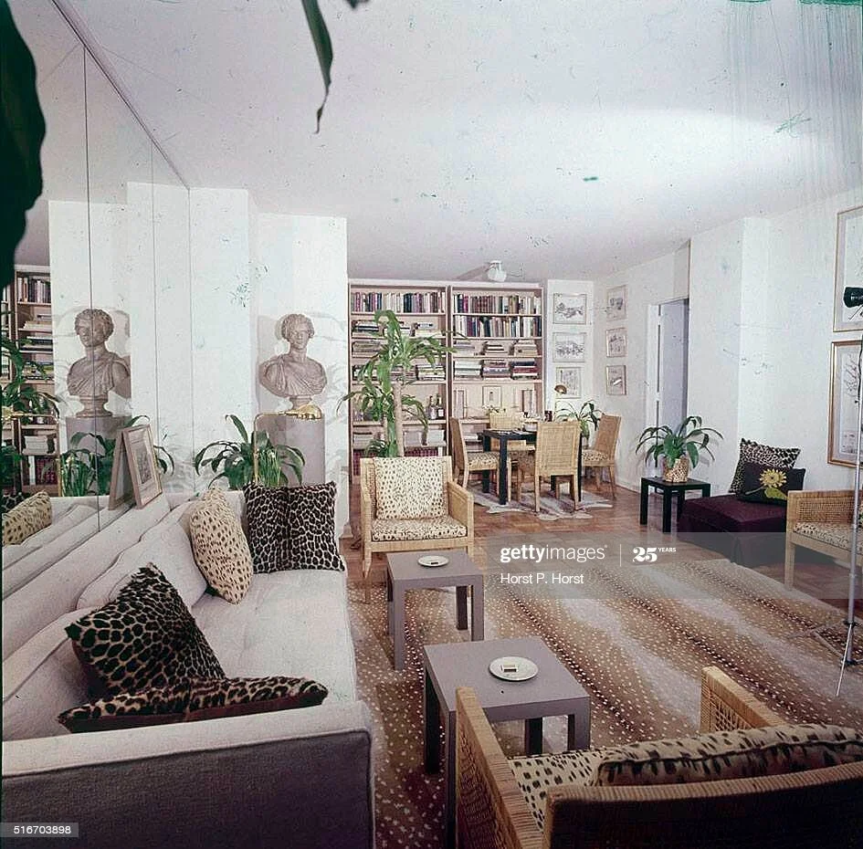
The 1970s had some bad design, of course, but it also included a frequent cameo by of one of my favorite things, animal print! Can it be done tastefully? Yes! Don’t you shake your head at me. I am going to show you the most use of animal print in one room (that is not in a massage parlor). This isn’t a cameo; it’s a Meryl Streep-size role.

Just today, I was casually going through some pictures of the New York apartment formerly belonging to the artist, interior designer, and former president of Parsons School of Design, Van Day Truex. I had first seen pictures of his New York apartment years ago, but this time I was really surprised at how many of his décor elements have been trending like crazy in the past few years.

Here’s his apartment from 1976:

van day truex apartment 1976.jpg

Antelope, leopard, and whatever Brunschwig’s “Les Touches” is supposed to evoke. And a grey sofa! Boho chic houseplants galore. All these things, which you scroll past on Instagram while waiting for your Starbucks, are OLD NEWS. But I prefer to say, classic.

And can we talk about the rattan chairs? (Did you think Serena and Lily came up with this stuff?)

White walls. Earthy neutrals with shots of black.

Is this more animal print than I am personally comfortable with? Well, probably. But it WORKS. And I stand by Van’s jungle/savanna/beach house in Manhattan.

So please, let me talk you into two leopard print pillows. It won’t hurt.

What I DON'T Tell You During a Color Consultation

I have a confession to make. I do a lot of consulting to select paint colors, and there is something I hold back from my clients.

I don’t reveal the name of the color. (At first.)

I try to cover up the name on my paint chip or large sample board. Why? Because names are often very misleading. They tell you how you THINK you should see a color, not how you actually see it.

For example, many readers may be familiar with the Benjamin Moore paint color Edgecomb Gray (HC-173). It looks like this:

Edgecomb-Gray-Swatch.jpg

Let’s say I suggest Edgecomb Gray and you respond that you hate grey. You’re sick of it. You want something else.

Maria Killam, a well-regarded color consultant in Canada, told the story of a client who did just that. Maria recommended Edgecomb Gray for the walls and her client said she absolutely did not want grey. So Maria pulled out Benjamin Moore’s Baby Fawn (OC-15) and her client was thrilled! What does Baby Fawn look like? Like this:

Edgecomb-Gray-Swatch.jpg

They look a lot the same, right? That’s because they are the same color. Benjamin Moore sometimes gives the exact same formula different names. It’s true.

Don’t be swayed by a name.

I don’t divulge the name right away because I don’t want my client to be unduly influenced by a silly moniker.

This is Benjamin Moore’s Paper White (1590). It is not the color of paper. It’s not even really white.

paper white.jpg

Some names are accurate, just ill-advised. Like Benjamin Moore’s Nacho Cheese (2018-40). Classy.

Nacho Cheese.jpg

Or Benjamin Moore’s OC-85, called Mayonnaise. (Someone needs to feed the people who come up with these names.) I find mayonnaise disgusting and certainly do not want it on my walls.

Mayonnaise.jpg

So yes, I hold back information during my color consultations. But only at first. And you’ll thank me because you’ll be focusing on the color, not the name!

You Never Stop Learning

I study every day. Every single day, I pull out one of my bazillion design books or click on a website to check out a prolific designer’s portfolio. It takes time and multiple visits to study even a single room, because I’m looking for something different every time. Sometimes it’s the furniture layout. Sometimes it’s the furniture itself. Sometimes it’s the paint colors. (Why did they put a mirror there? How does the layout enhance the natural views? Why does this color combination work when it seems like it shouldn’t?)

I recommend, if you are serious about design or just serious about designing your own home, that you do the same. There are a thousand large and small decisions that go into decorating a room, and the more you ask yourself why a particular decision was made, the better you train yourself to “see” and problem-solve.

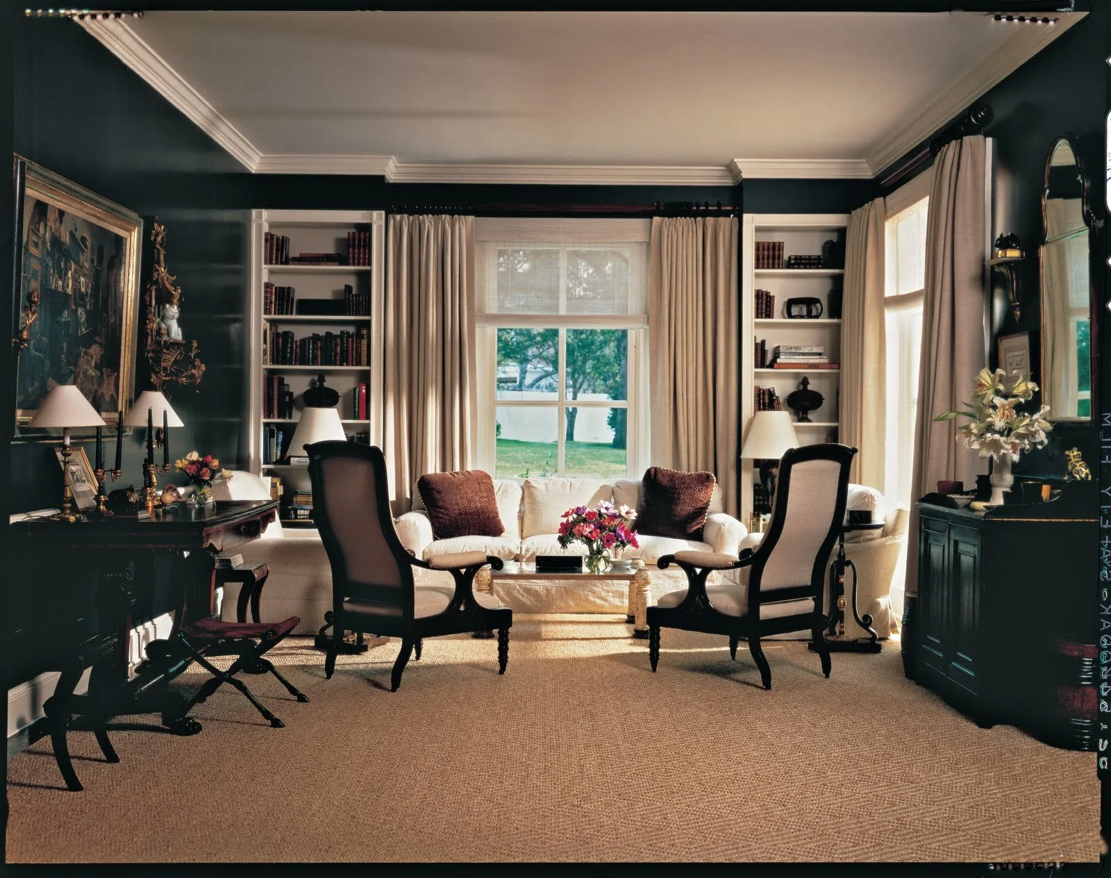
Look at this room by the late Mark Hampton. It was probably done in the late 1990s, but I’m not certain.

mark hampton sisal.jpg

There are a lot of things to unpack here, but the thing that struck me immediately was: Imagine if, instead of a sisal rug, he had used a traditional Persian rug. It wouldn’t feel as casual, light and airy. It would feel more serious and formal. Sisal knocks down the formality a lot. Does your space feel too formal or stuffy? Maybe a sisal or jute rug is the answer.

Here’s a library Corey Damen Jenkins did for a showhouse.

Corey D Jenkins library.jpg

What’s great about this is that libraries tend to be very masculine. Why did he paint it pink and wallpaper the ceiling with a floral? To turn the concept of a library on its head, to shake free of the stereotypical library’s masculine vibe. Why can’t a library be feminine? Of course it can. Do you have a space that you’d to give an unexpected vibe? Paint it an unexpected color, perhaps.

If you ask “why,” you might see a solution to your own design problems.

I Called This Years Ago

This actually isn’t gloating because I can’t be the only one who saw this coming. But I’ll pat myself on the back anyway. As the grey trend was waning (approximately 2016-17), we started seeing two things emerge in the world of interiors. One was the black and white, art deco revival look, and, more recently, DRUM ROLL….Beige.

A few years ago, I noted a few things. One, the lifespan of a neutral color trend is approximately 10 years (some people are early adopters and some are later). So that’s about 2007-2017 for the grey trend.

Two, nature abhors a vacuum, so if not grey, what? There aren’t that many neutrals and we’re still recovering from the brown/gold/pinky beige Tuscan trend years, so a (cooler) beige was a gimme.

(Side note: once the word “greige” becomes a thing, you already know some people are looking to warm up their greys, and will slowly descend more into beige, eventually, like easing into a hot tub.)

Three, the enthusiasm for midcentury modern, which morphed into the postmodern enthusiasm we’re seeing (a lot of late 70s and 80s curved shapes in furniture, for example), meant that one of the beloved neutrals of the late 70s and 80s (beige) would return too. I mean, when you start seeing macrame wall hangings, you know beige isn’t far behind.

Does this mean you shouldn’t decorate with grey? Again, this comes down to the number one question I ask clients— do you love it? Does it make you feel good in your home? That’s not the end of the inquiry but it’s definitely the first question. If you’re choosing anything because that’s what all your friends are choosing and you don’t want to look unfashionable, that’s the WRONG reason.

So let’s look at some beige inspiration!

This was taken off the Architectural Digest website, from an article about Dallas-based interior designer Josh Pickering (published 9/11/20).

JOSHPICKERING_ AD.jpg

From Elle Decor’s website this month, a spotlight on Nate Berkus’s Monatuk home. His family is adorable.

Nate Berkus Montauk Elle Decor.jpg

I, too, like to casually lounge in my home while wearing outfits that perfectly coordinate with my decor. Don’t you?

OMG it’s pampas grass! Image from Architectural Digest https://www.architecturaldigest.com/gallery/children-of-the-70s-will-remember-these-home-trends

OMG it’s pampas grass! Image from Architectural Digest https://www.architecturaldigest.com/gallery/children-of-the-70s-will-remember-these-home-trends

In another post, I’ll describe the three undertones of beige that will be extremely helpful in selecting the right one for your walls, should you decide this is your new neutral.

And if you still love grey, I can help you incorporate it so that it looks classic and timeless.

Thanks for reading!

Shopping for "Special," Online

The difference between a good room and a great room is usually at least one antique or vintage piece. It can be a painting, a dresser, a rug, a lamp, whatever. An older piece adds character, history, and keeps things from looking to perfect and matchy. It makes a room look collected over time (even if it was thrown together by a decorator in six weeks).

“That’s really great, Dana, but I don’t have a rich aunt who left me any artwork,” you say?

If I can’t go to local estate sales or peruse antique shops, I immediately turn to online sources. Some are better than others. This post is to talk about two that I use all the time, Chairish.com and 1stDibs.com.

First, I am not compensated by Chairish or 1stDibs. Neither has asked me to to promote them. They have no idea I’m writing about them. And I don’t sell anything on either site. But I love vintage and antique shopping and have had enough good experiences with these outfits that I want to encourage others to give them a try. I bought my first item with 1stDibs in 2012 and my first item off Chairish last year.

Basically, they are each a centralized marketplace matching buyers and sellers. Chairish and 1stDibs are similar. With both, you create an account and start searching for items by category, with the ability to filter results to a great degree of specificity. You can follow items and sellers (or “shops”). Chairish shows you the name of the shop, but a couple years ago 1stDibs started keeping the seller’s name hidden, divulging only the location. Can you find ways to figure out who the seller is? Yes, that’s possible. You can figure out how to go around the site. But if you complete a sale outside of the websites you risk either getting banned, or losing buyer protection and customer service.

In my opinion, 1stDibs tends to have more expensive listings than Chairish but they both have their range of high and lower end things. Rarely are items cross-listed. You should absolutely bargain, but only after a little preliminary research into what you’re looking to purchase. And keep an eye on shipping costs.

Both sites offer customer service and other benefits, and while there are still risks, I find it less “Wild West” than eBay because of their vetting and review process. And if you have a good experience purchasing off the site, you can always go directly to that seller next time rather than through the third-party site.

So what have I bought off 1stDibs and Chairish? I don’t want to list everything but, for example: An Italian bombé chest, a French end table from circa 1790, Chinese famille verte rouleau vases, vintage malachite objects, a Meiji period Japanese bowl…still going! Every piece has a story and adds character to a room.

It’s a special treat to find an original vintage painting for a very, very reasonable price instead of buying a framed print from a big retailer. Be patient and check back often. Follow items you like and often the seller will message you with a discounted offer to sell it.

And have fun searching for a unique piece!

Don't Be "Bored" (and Batten)

I love touring homes with beautiful architecture, although these days I’m doing it online. By “beautiful,” I don’t necessarily mean ornate or formal. There are beautiful sleek, modernist homes that have very little embellishment.  There are modest bungalows that have beautiful architecture. Their proportion, materials, and history are beautiful. Beautiful homes look like they were built with care and attention to detail.

Sounds nice, but many people don’t live in houses like that. Then we have to take matters into our own hands.

Do you feel like your walls need something, but you can’t put your finger on what?

Try adding some interior architectural interest. Whether board and batten, beadboard, wainscoting, or box moulding (a few examples), you can easily and inexpensively transform a room into something special. If you are handy, these are DIY projects. Otherwise, find a finish carpenter to help you.

What can you do with some MDF, pine board, and paint? Imagine these walls before, as plain drywall or plaster:

Source: Remodelista.com

Source: Remodelista.com

Source: Elle Decor

Source: Elle Decor

Source: Southernhospitalityblog.com

Source: Southernhospitalityblog.com

Source unknown

Source unknown

Source: Elle Decor

Source: Elle Decor

Even your ceiling can be jazzed up:

Source: Architectural Digest

Source: Architectural Digest

You needn’t stick to traditional designs:

Source unknown

Source unknown

It requires some research and planning before you get your nail gun, however. If you think this might be a project for you, feel free to reach out to me with questions.


What Am I Looking At?

Hello again! Back for another installment of my series, “What Am I Looking At?”….This time, it’s this cute little guy and his buddies:

original lalanne.jpg

These aren’t children’s toys; rather, they are “Lalanne Sheep” (“Moutons de Laine”), the creation of sculptor François-Xavier Lalanne, and quite rare and valuable today. He and his sculptor wife, Claude, known together as “Les Lalanne,” were influenced and befriended in Paris by Surrealists such as Man Ray. The sheep, which are meant to be used as chairs, were exhibited in Paris in 1965. According to Christie’s, they appeared under the title “Pour Polythème,” referring to the part of the Odyssey where Ulysses and his comrades blind the cyclops Polyphemus and escape by clinging to the bellies of the cyclops’ giant sheep. Some have interpreted the sheep as a commentary on bourgeois “follower” culture, and some have viewed the sheep as a juxtoposition of outdoor-indoor/wild-tame. They are both charming and absurd in a residential context.

“Les Lalanne.” Photo: Willy Rizzo

“Les Lalanne.” Photo: Willy Rizzo

Yves Saint Laurent was the first private patron of Les Lalanne. He had several sculptures created, including a legendary bar (seen below) that decorated his apartment at the Place Vauban. Here, several sheep roam about the library of Saint Laurent and his partner, Pierre Bergé.

Photo: Horst P. Horst

Photo: Horst P. Horst

Les Lalanne rarely collaborated, however. François-Xavier preferred animal subjects, creating a hippopotomus that turned into a bathtub/sink/vanity combination, for example, while Claude preferred to depict vegetation, such as chairs shaped like gingko leaves. In 1976 the singer Serge Gainsbourg named an album after Claude Lalanne’s sculpture L’Homme à Tête de Chou, or “The Man with the Head of a Cabbage”, and placed the image of her creation on the front cover.

François-Xavier died in 2008. His wife died in 2019.

A rare collaboration of gilt sheep between husband and wife sold at auction for $2.4 million last year.

Designer Valentino Garavani with a menagerie. Photo: Lukas Wassman

Designer Valentino Garavani with a menagerie. Photo: Lukas Wassman

If you don’t have that kind of cash to drop on the originals, good knock-offs (gasp!) start around $3,500. How bourgeois.

Three Powder Rooms

Hello, and I hope everyone is healthy and safe. As I have had a bit of downtime lately (haven’t we all?), I thought I’d have some fun coming up with powder room ideas. Powder rooms are probably my favorite to design, because while they are used rarely (and for brief periods of time when they are used), they are often seen by guests. This makes powder rooms perfect opportunities for a homeowner to show off his or her personality.

Below are three different styles (and believe me, I can do more). The first is a black and white classic. The second is a relaxing, neutral retreat. And the third, a colorful pick-me-up. See if any of them inspire you!

0001.jpg
0001.jpg
0001.jpg

Another wonderful thing about powder rooms is that you can use high end materials and finishes without guilt, because a little goes a long way. Use your imagination or hire a designer to make it a spot that is fun, fancy and a reflection of you.

A Pick-Me-Up for Tough Times

We’re all staying home to avoid the novel coronavirus COVID-19, and while we’re probably getting some much-needed time on the sectional, mainly I think we’re alternating among feelings of anxiety, boredom and frustration. I am grateful to the health professionals, educators, scientists, and everyone else who is working to protect and preserve our society in this pandemic. Thank you.

Every one of us endures the isolation of the COVID-19 pandemic differently. Silly as it may sound, some of us feel the urge to freshen up our homes, tidy up, clean out our closets and feel productive. It’s a small way to exert control over our lives.

In between managing my business and the little ones at home, I’ve started rearranging my vignettes and bookcases so things seem fresh. After you pass by the same arrangement over and over, you become blind to it. It becomes really boring, and you are going to be home for a while. Better not get bored. When you’re too busy to work on a tablescape or vignette you can stop, come back to it, and play around with the arrangement until you are satisfied. Just think— it will be ready for when guests come over again!

The best part about re-styling your home is that there’s no need to go shopping. As you go through your closets and drawers, you’ll find items you like but forgot about. You probably have plenty of objects already in your home to display on your bookcases, consoles and dressers. I guarantee, if I were to stop by your home, I could pull out all kinds of objects suitable for display. You can cull them from your kitchen, your garden, your library and probably even your attic. Anything you want to fill in the blanks can come from online shopping or craft time with your children. Now’s the time to learn oragami, watercolor painting, and woodworking, right?

Minimalists, hear me out. You can embrace this task because the most vital step is EDITING, not adding to the clutter. I would much rather see one beautiful white vase on a shelf than 52 little tchotckes.

I’ve been working on grouping items I love, which also have a connection to one another. Here are some pictures of what I’ve started:

IMG_2816.jpg
IMG_2819.jpg

The top photo is of a modest malachite collection. I started buying pieces slowly, over time, but initially they were in different rooms. However, if you group similar items together, they have more visual presence than if they were separated.

The bottom photo shows some vintage green lowball glasses I found on Chairish.com. Find some books to prop up decorative object and showcase your interests. Books also contribute color to the composition, vary the height of the objects to keep the eye moving, and take up empty space you don’t otherwise know what to do with. Peeking out at the bottom of the photo is a pretty white platter I found in my kitchen.

If you are able to shop in-store for groceries, and your store carries plants, pick up an orchid or succulent to add to the mix. Find some candles, candlesticks, bowls and other items. Go online for inspiration.

We will get through this. Focus on all the fun you will have in your house when we can all get together with each other again. Be well and think positive.

What Am I Looking At?

I recently started a series called “What am I looking at?” that briefly highlights a design that we see all the time in restaurants, hotels, and magazines, but may not know anything about. Today I am keeping in the mid-century modern vein, highlighting a chair from visionary American furniture designer Milo Baughman. It was extremely difficult to choose one chair of his to focus on, but I went with the “Good Egg” swivel chair of 1967 because I just saw a version in West Elm. They won’t call it that, but that’s what it is.

A brief background of Milo Baughman: He was raised in California and is more famously associated with his 50-year relationship designing furniture for North Carolina-based Thayer Coggin, which still produces his designs.

Here’s the “Good Egg” chair:

Thayer Coggin’s image of their “Good Egg” swivel chair

Thayer Coggin’s image of their “Good Egg” swivel chair

When I look at this chair, I imagine how hard it was at the time for people to understand and embrace such an unusual design. It’s very similar in many ways to Finnish designer Eero Aarnio’s “Ball” chair and other “egg” shaped chairs, which did precede Baughman’s version. However, what’s interesting to me about Baughman’s chair is that it is cozy but fairly open to facilitate conversation, and it swivels. While other similar designs cocoon or hide a person seating within, Baughman’s was more for the extrovert than introvert. Aarnio’s version is hard, with a fiberglass shell, that further protects the person seated within. It’s idea for reading, for example. Baughman’s chair is a nest for conversation.

Eero Aarnio’s “Ball Chair”

Eero Aarnio’s “Ball Chair”

And because I am so enamored of it, I have to add an image of Danish architect and designer Arne Jacobsen’s “Egg” chair, created in 1958 for the SAS Royal Hotel in Copenhagen. I love how it recalls the traditional lines of a wingback chair but totally updates it and puts it on an exposed chrome swivel base.

Arne Jacobsen’s “Egg” chair in an updated leather version

Arne Jacobsen’s “Egg” chair in an updated leather version

Like the “Good Egg” chair, Arne Jacobsen’s chair looks welcoming and comfortable, facilitating conversation. Also like Baughman’s designs, Jacobsen’s have stood the test of time. They may not be everyone’s taste, but they are iconic.

What Am I Looking At?

Hey readers, for the new year I decided to start a little series called “What Am I Looking At?” Sometimes you see an interesting light fixture in a restaurant or a cool chair in a hotel, but do not realize it’s a famous design or has an interesting history.

I’m kicking it off with the PH Artichoke. You’ve seen this design before. In English we call it the PH Artichoke, but in Danish it is known as the PH Kogle, or conifer cone.

PH-Artichoke-Lamp-by-Poul-Henningsen-03.jpg
Actor Bryan Cranston’s Beach House, featured in Dwell

Actor Bryan Cranston’s Beach House, featured in Dwell

Restaurant.jpg
1950s-Artichoke-Lamp-Interior3.jpg

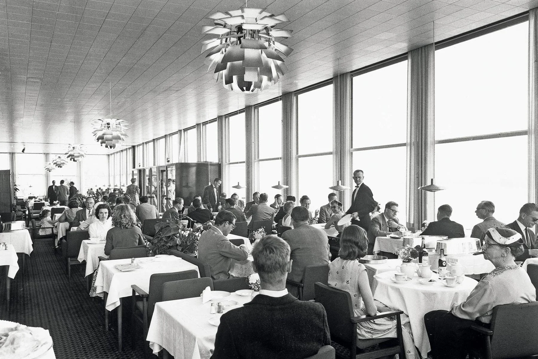
The PH Artichoke was designed in 1958 by Danish designer, critic and writer Poul Henningsen for the Langelinie Pavillonen, a Copenhagen restaurant. Here’s an image of it in situ:

Image: Louis Poulsen

Image: Louis Poulsen

Henningsen’s greatest design contributions were in the area of illumination. He was a determined crusader against the glaring light of electric bulbs. The PH Artichoke was a triumph for the designer in this regard. It has 72 leaves, positioned so as to provide totally glare-free light from any angle. Henningsen originally designed the fixture with solid copper leaves with a satin finish and with a rose finish on the leaves' interiors. The light created a beautiful, flattering glow as a result. Today it is produced in several colors by the original manufacturer, Louis Poulsen, retailing for approximately $10,000. Of course, reproductions are available elsewhere, and vintage originals are sold as well.

He has been quoted as saying, "The PH is constructed with the most difficult and noble task in mind: lighting in the home. The aim is to beautify the home and those who live there, to make the evening restful and relaxing."

“Brown furniture” and “Grand-Millennials”: My predictions for 2020

I like furniture with stories. Almost ten years ago, I lived in California. I was perusing 1stDibs, which at the time was a new website for finding high quality art, furniture, and collectibles. I was looking for a bombé chest and saw a beautiful 1920s Italian bombé with parquetry and worn brass drawer pulls. The problem was, the seller was in Palm Beach, Florida. I had no idea how to get it to California. But I did my research, learned about LTL (less-than-truckload) carriers and, after two weeks, I had my bombé chest. When it arrived, I was so excited! This piece has been from California to Luxembourg to New York, where it sits in my foyer. I love that I had to search for and plan a little to get her home. I love that she’s unlike any other bombé chest I’ve seen, and wonder, who owned her previously?

Antiques dealers and interior designers talk about the recent death of “brown furniture,” but it’s probably more accurate to say that antiques are a tougher sell than vintage pieces right now, and true vintage is tougher to sell than similar looking new reproduction pieces. “Antique” refers to items over 100 years old, while “vintage” is usually defined as between 20 and 100 years old.

Even “trendy” vintage requires a particular buyer, compared to similar (knockoff) brand new items. By “trendy” I mean primarily mid-century modern or postmodern, like a Danish teak desk from the 1960s, Karl Springer 1980 coffee table or Curtis Jeré metal sculptures from the 1960s through the ‘80s. (Fun fact: there is no Curtis Jeré, just two guys from California named Jerry Fels and Curtis Freiler who wanted to sell a “softer,” more marketable form of the brutalist art being produced at the time.)

I am sad that many people refuse to buy antique or vintage. Whether it has a recognizable provenance or not, an older piece can make a room much more interesting. Maybe they think antiques are expensive, but I’ve found really nice antiques for the same price as a new, mass produced item.

I think people may be turned off by the fact that they can’t just box up and return these items if they change their minds. There’s a fear of commitment. Also, it’s hard to trust an independent antiques dealer versus a national chain, but a bit of homework will allay those fears.

I think some people think “old” is gross or used up, or too “old-fashioned”. Maybe it requires some refurbishing, which, to be fair, can be costly. 

However, I’d say to the hesitant, look at Darryl Carter for a rebuttal.

Darryl Carter is a DC-based lawyer-turned-interior designer who is incredibly thoughtful and analytical in his design choices. (As a formerly practicing attorney myself, I like to think it’s a lawyer thing). He was interviewed by a home furnishings website about his integration of old and new, and his philosophy of treasuring timeworn, beautiful and humorous objects.

https://www.onekingslane.com/live-love-home/darryl-carter-home-tour/

Note that Darryl likes objects with a story. That takes time and luck. Sometimes we are so determined to finish decorating our homes that we don’t want to wait for a special piece, but I recommend you decorate with at least a few “found” items from travels or flea markets. And remember, you’re never done decorating a room. It changes and develops just as you change and develop as a person.

The fastest way to get ahold of interesting and well-made things is to check out local antique shops and reputable online sellers like 1stDibs and Chairish. You don’t need expensive pieces, just ones you find beautiful, timeless, humorous or even slightly controversial.

Some good news: conspicuous consumption is being replaced by conscious consumption, an environmentally conscious way of buying quality, lasting furnishings. Instead of throwing away furniture, younger generations are reusing it and either painting it or enjoying the warm, rich look older wood gives a room. The term “grand-millennial” refers to someone young who appreciates traditional design (think chinoiserie, cabriole legs and floral wallpaper!) and designers of decades past (Dorothy Draper, Billy Baldwin, Sister Parish and Albert Hadley) but puts a modern spin on them.

Here’s an article from House Beautiful about grand-millennials:

https://www.housebeautiful.com/lifestyle/a28594040/grandmillennial-design/

I predict 2020 will bring more appreciation of antiques and vintage furniture, reusing what we have, and creative ways to combine the past with the future in design.

Take a picture...to your designer

When I meet with clients early on, in the conceptual phase of a project, I always suggest they provide pictures to express what they hope to achieve. I don’t do this out of laziness or lack of creativity. I do this because an image gives me a lot of clues about how to give my clients the best design possible.

Words can mean a lot of things to a lot of people. For instance, let’s say a person tells me she wants a living room that is “modern.” Which of these fits the bill?

Bruns Architecture

Bruns Architecture

Studio Aiko

Studio Aiko

Grace Home Furnishings

Grace Home Furnishings

Anthony Baratta

Anthony Baratta

Blu Interiors

Blu Interiors

Clearly, we are going to be delving into a lot of details, such as color and pattern preferences (or aversions). But while the term can have a precise meaning to designers, “modern” can mean different things to different people. Some homeowners mean “contemporary” and some mean “mid-century modern”; some mean the decor should be truly minimal in every way (form follows function!), and some mean they want more trendy colors. And finally, some folks say “modern” but really mean “transitional” or even “I just want to update/freshen my current traditional style”.

Occasionally, I will get pictures from Instagram or catalogs that show off very white, sunny and bright interiors. Studio McGee, for example, does a beautiful job with white, which is their signature “color”. Here is an example of their work:

Studio McGee

Studio McGee

Look at the tall ceiling, that natural light! It is a beautiful (professionally styled and lit) photo! But if we are working with eight-foot ceilings and minimal natural light, I owe my client an awareness of other methods besides white paint to lighten and brighten a room. In other words, I need to make sure we feel free to dream BIG, but also understand the quirks and beauty in their own home may require a different tack. Instead of painting everything white (which can look dull and shadowy in the wrong application) we could embrace color to give a certain room its “wow factor.” We would strategically add lighting fixtures to brighten things up, saving the white walls for another room in the house that can take white better. However, I don’t like to focus on “can’t”— so we then discuss what is definitely do-able and will look beautiful in their space.

We might also discuss, for example, that my client is hoping their home can look just as neat and tidy as in the pictures. So how can I provide the best storage solutions to achieve that result?

Pictures tell me about how my client wants to see their home and themselves. Relaxed, glamourous, edgy or traditionally elegant. They are a helpful jumping off point to a lot more discussion. Pictures are invaluable tools in the dialogue between designer and client.

To Accent Wall or Not?

Today I read an article that discussed various home decorating trends that interior designers wished would die. It’s a common trope, easy clickbait and, usually, not particularly helpful.

One of the trends mentioned on that list has been around for many, many years. I am not sure it qualifies as a “trend” anymore. The “accent wall” or “feature wall” is a wall painted or covered in a manner unlike the other walls in a room, so that it stands out visually.

One of the famous interior designers the magazine interviewed cited the accent wall as a trend that needs to go away, and she had a reasoned explanation. In her mind, the accent wall stands out in a way that disrupts the harmony and balance of a room. I agree that it often shouts at you like a singer in a chorus who is intent on standing out when she should be blending in.

Yet a good accent wall can exist in harmony with the rest of the room. If you’re thinking of creating one, I suggest you start by asking yourself why. Sometimes accent walls are just the result of overenthusiastic decorating. Sometimes the homeowner is color-shy but wants to dip a toe into color by painting just one wall. (That rarely works out.) Sometimes interior designers and color consultants feel that they are not justifying their fees if they do not show off an unnecessarily complicated paint schedule.

Here are a few examples of good accent walls.

4625c48cad24997c1a82a1b77a5c1e1d.jpg
4c659ca834a9932f070b196465467cd4--fireplace-accent-walls-white-fireplace.jpg
d09376a01b39c72ddb7f4a396b48df3f--black-accent-wall-living-room-black-accent-walls.jpg
fbd461c9881cce480f75d6f2d26100b8.jpg
gray paper accent wall in bedroom.jpg

The first four images build a feature wall around a focal point, the fireplace. The contrasting color frames the feature rather than competing with anything else. It covers just a small area worth highlighting.

In the first example, the feature is the fireplace and the accent is created with stone, while the adjacent deep brown paint recedes.

In the bedroom example, the wallpaper isn’t jarring. It is almost the same color as the adjacent wall and adds some soft visual interest behind the focal point of the bed. The curves of the pattern are echoed in the headboard.

Accent wall niche.jpg

Source: Brewster Wallcoverings

If you have a niche or other architectural feature worth highlighting, consider accenting it with wallpaper or a contrasting paint color, as above. Note that this accent is on the wall behind the bed, which is almost always going to be your focal point in a bedroom.

Is the accent wall going to distract the eye or make the room feel unbalanced? Or accentuate natural focal points like a fireplace or bed?

And finally, be wary of blanket dismissals— or endorsements—of anything design related, be they called trendy or timeless. It’s more important to understand what you want to accomplish in your design. If a strategy helps you accomplish that objective, it is simply a helpful design tool.